This problem of light colours is well expressed in the work of Roi Vaara. In 1983 Vaara painted himself with white paint and walked down the streets of Helsinki (fig. 60). Vaara (![]()
![]() para. 14) says, ‘The idea came to me from the notion of the white race, and so I tried to disappear in the landscape’. Yet, looking at the photo documenting this work (fig. 60), I would suggest that Vaara did not manage to disappear in the landscape at all, but on the contrary, became very noticeable against the many other ‘hues’ around him.
para. 14) says, ‘The idea came to me from the notion of the white race, and so I tried to disappear in the landscape’. Yet, looking at the photo documenting this work (fig. 60), I would suggest that Vaara did not manage to disappear in the landscape at all, but on the contrary, became very noticeable against the many other ‘hues’ around him.
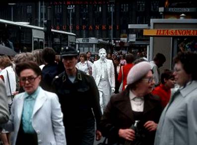
Figure 60: Roi Vaara, White Man (1983, street action) Helsinki, Finland. Photo: © Harri Larjosto. Image obtained from Roi Vaara. Permission to use image obtained from Roi Vaara.
Yet, this may not be seen as an artistic ‘problem’ to the extent that artists argue that they seek to bring something into this world, not to ‘depart’ from this world to the spiritual realm. In that regard, white colour, which shines bright amidst darker hues, can be seen as a way of bringing spiritual qualities to our reality. To use an old analogy – to shine the light colour against the darker ones. The need of a dark hue for the white to be visible is notable in another Vaara work, his Wet Paint Handshakes (2008; fig. 61). In this work Vaara tries to transfer the qualities of the white hue to the audience who shake his hand which had been dipped in white colour, and yet Vaara (![]()
![]() para. 10) admits to the need for a dark background:
para. 10) admits to the need for a dark background:
‘I wear black tuxedo… and the contrast between the black and white makes the performance visually prominent. After each handshake I wipe the white paint off my hands on my black tuxedo, so the tuxedo becomes ‘dirty’ with white.’
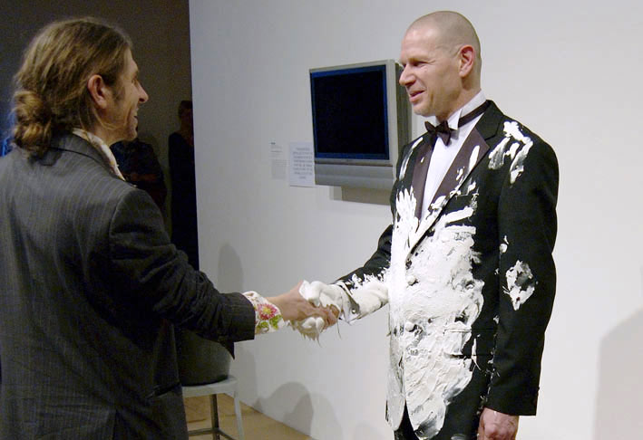
Figure 61: Roi Vaara (right), Wet Paint Handshakes (2008, performance in Hayward Gallery, London, black tuxedo, white paint). Photo: © Naranja. Image obtained from Roi Vaara. Permission to use image obtained from Roi Vaara.
It is interesting that the artist feels a need to use two opposing hues that contradict each other, and yet complement and support one another and create something new, for example, a new view on dirt, as Vaara explains: the tuxedo becomes dirty, yet ‘dirty’ with white. The purity of white is brought down, so to speak, even into dirt. White colour with its purity is used by the artist as a symbol that purifies the physical world.
I see the works of Piet Mondrian as a way forward with the use of light colours. I consider his work as an attempt to express qualities of white not by layering white against other colours, but rather by layering other colours against white. Basic colours of red, yellow and blue are layered within black grid bars against white, as can be seen in the work Composition 10 (1939-1942) (fig. 62).
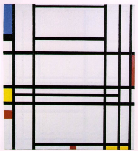
Figure 62: Piet Mondrian, Composition 10 (1939-1942). Private collection (Lauder Collection, New York). Image © 2013 Mondrian/ Holtzman Trust c/o HCR International USA. Image and permission to use obtained from Mondrian/ Holtzman Trust c/o HCR International USA.
In my view the colours and the black grid stand as representation of the physical reality, through which we can peer at the white behind. The peering at the spiritual through the physical in the works of Mondrian does not consist of looking through glasses or a telescope, so to speak, but rather looking through a microscope. Mondrian’s work seems to me as if one looks at a blood cell through a microscope, where patters of physical cells are abstracted into geometrical shapes. The white that is revealed is the spiritual within the blood of people, within us. Mondrian’s own arguments can support my view. Mondrian (Mondrian, Holtzman, & James, 1993: 14) explains that the more basic a colour is, the more inwards and pure its expression. In that respect white shows us the purity which is inside of us, and not necessarily external to us. It can also be viewed as a simple grid, or formula, through which we can connect to our own inner creativity.
Likewise, I have attempted to externalise the inner feeling of purity through poems written and performed as part of an art event in Southampton (August 2007). A video camera was filming the event, yet it stood on a tripod in a bad position, resulting in low-quality footage. When I decided to make a film of the footage, I realised that I would need to create many visuals to replace parts of the footage, and decided on creating visuals consisting of white space into which graphic words will appear. The words are the text of the poems, and they appear one after the other in synchronicity with the spoken words of the poems, resulting in an independent composition of an image (fig. 63).
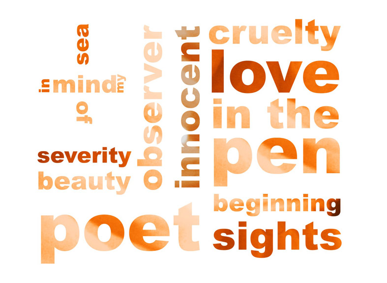
Figure 63: Still image from the film Explorers of the Heart (2007). Image © Gil Dekel.
While Mondrian’s work can be seen as an attempt to look into the inner essence of people, the white DNA so to speak, my work attempts to bring out the messages from within that DNA, to externalise the words that are within the white DNA, allowing them to emerge.
My premise would be that abstract shapes are seen by artists as universal forms that are not bound to a specific culture. Abstractions serve as a flexible tool to capture the inner essence, allowing for a free flow of ideas within a shape that is not fixed to a convention or tradition, but rather it is pure. Purity brings with it light and white colours, as a carrier of inner essence that artists seek to bring forward into our reality.
I suggest that the vehicle that is used for this bringing forward, or movement of an inner idea, is the use of vivid and transparent colours.