The need to express inner purity in art work sees the artists using vivid and transparent colours as a mean to create intense visible movement symbolising the movement of inner purity. Michael Lancaster, in his study Colourscape (1996), suggests a theory that may explain why this movement is carried out through use of colours. Lancaster (1996: 6) explains that colours depend on relationships to the extent that no colour can be seen in isolation. Colours are working in what can be seen as a collaboration, which does not relate necessarily to the object on which they lie. In that way colours are used by artists for their inner relations that create a sense of inner movement within the art work.
Vivid / transparent
Kandinsky explains the inner qualities of vivid colours and the way that they seem to glow. Kandinsky (1972: 61) asserts that each colour can extend through variations between warm and cold, yet red has the most extensive scale. Red, he says, has an inner glow, which creates a movement within itself, not a movement outside and not even inside.
The inner qualities of primary colours are exemplified in the Pointillism technique which applied separate dots of colours on the canvas (end of the 19th century). Matisse’s painting Luxe, Calme et Volupté from 1904 (fig. 64) is an example of the pointillist technique, where vivid colours were created not by mixing, but by painting small dots side by side. The Pointillism technique is important not only for its use of colour but also for its use of colours as the shape. The shape that is required to contain the colour is the shape of the dot itself which is the colour. In that way the pointillist technique has turned colour into the abstract shape, without the need to create another shape for the purpose of dispensing the colour. Kazimir Malevich (Crone & Moos, 1991: 1) reflected in 1908: ‘Until now there was a realism of objects, but not of painted units of colour…’ The Pointillists have managed to demonstrate painting with units of colour. This issue does not seem to be mentioned too often in the academic literature, perhaps because the subject matters of the paintings, as can be seen in the case of Matisse’s work, are representations of objects (figures, trees, landscape) to the effect that we may forget that such representations are created by the familiarities of the viewer’s memory with these images. As it stands to itself, the painting can represents colour and not necessarily images.
[awaiting permission to upload image 64]
Figure 64: Henri Matisse, Luxe, Calme et Volupté (1904, oil.) Paris: Musée National d’Art Moderne.
Since colours are not mixed they retain their individual vividness. Yet, when the viewer looks at the painting from a distance, colours blend to create new hues. This effect of colours blending is used widely today in modern digital printing, such as in outdoor large scale poster prints.
While Matisse has managed to create shape through the physical property of dots of colours, using several colours, modern artists tend to pick or focus on a single colour only, and use it as the main source for their work. I see modern art works as if they have been zooming into such works as Matisse’s, and focusing only on one element or colour. Artist Felice Varini tends to apply a single colour, mainly blue or red, painting on urban landscapes. In that way the colour’s hue is altered as the result of the hue of the surface on which it is applied (fig. 65), and new hues are created through the hue of the urban’s ‘…surface and the light conditions’ (![]()
![]() para. 19). While Matisse’s intense colour would blend with colours beside it, from ‘side to side’ so to speak, Felice’s colour blends with colours behind it (surface) and in front of it (sun). This illustrates Felice’s ambition to break away from the flatness of the canvass, as he explains (
para. 19). While Matisse’s intense colour would blend with colours beside it, from ‘side to side’ so to speak, Felice’s colour blends with colours behind it (surface) and in front of it (sun). This illustrates Felice’s ambition to break away from the flatness of the canvass, as he explains (![]()
![]() para. 18), and to allow for a three-dimensional blending, where the intensity of the colour becomes a merging point between the sky and the earth. It is in this form that art has reached a point in history where colour does not represent an object, but is the culmination of it.
para. 18), and to allow for a three-dimensional blending, where the intensity of the colour becomes a merging point between the sky and the earth. It is in this form that art has reached a point in history where colour does not represent an object, but is the culmination of it.
The inner purity of white receives an intense movement through intense colours, having an inner glow, as Kandinsky asserted – a side to side glow, in Pointillism, as well as an up and down or front and behind, seen in Felice’s works (fig. 65).
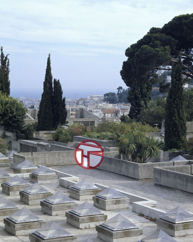
Figure 65: Felice Varini, Terrace No. 2 (1988, Acrylic paint on urban landscape.) Villa Arson, Nice, France. Image © the artist. Permission to use image obtained from the artist.