Likewise, Gabo (Annely Juda Fine Art, 2003: [3]) accepts the quality that allows for depths in colour, but he rejects the surface of colour that reflects light. His view is interesting in that it tells us that colours may have a quality in which they withdrawn inside, from the surface of the painting and to inside. In that way, the quality of watercolours to move from the surface through layers, and into the canvas, is challenged by Gabo, who asserts that colour does not ‘begin’ on its surface. Rather, colour ‘begins’ from what I could only suggest to describe as ‘the other side of the colour’. Gabo suggests to look from within colour and deeper forwards, or inwards into the colour. Looking beyond the surface, according to Gabo (Annely Juda Fine Art, 2003: [7]) is like looking into our own psychological selves.
I have been inspired by the idea of looking beyond the surface and into our own psychological selves, and created an art exhibition held in early 2007. I have used printed words as a symbol of thoughts, where thoughts can be seen as representing one’s psychological self. Words were printed on translucent stripes of paper, and hung from the ceiling. The audience was invited to stand behind the stripes, observing the reverse of the words, the ‘other’ sides of words. Observing words from behind, this work asked, where do words come from and where do they stay in one’s mind, from behind the mind, or in front of the mind? (fig. 72-73).
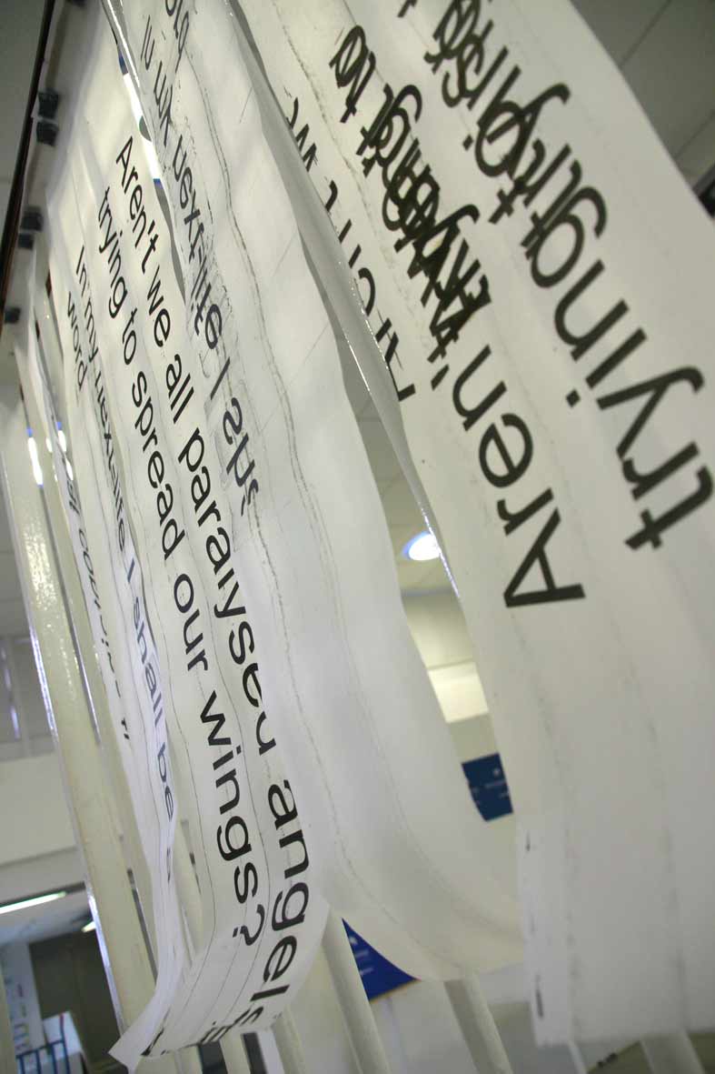
Figure 72: The Other Side of Words (2007, print on transparent stripes). Image © Gil Dekel
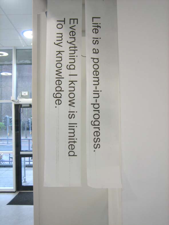
Figure 73: The Other Side of Words (2007, print on transparent stripes). Image © Gil Dekel.
With Gabo’s insistence that colour is an event in itself, not connected to the essence of the object on which it is laid (Annely Juda Fine Art, 2003: [3-4]), we should examine how he treats the transparent quality in his works. Feeling that space is not around us but within us, Gabo uses glass and plastics which allow one to look inside, through it, and get a feeling of a space inside the image that is created (fig. 74). According to Gabo, all people are transparent (Bickers & Wilson, 2007: 38), yet it should be noted that the use of glass and plastics was not merely done for its transparent qualities, but also as a statement of embracing modernity. Gabo believed that art should embrace new materials that technology in the early 20th century had to offer, especially the improved transparent plastics (Lodder, 2007). In that way I suggest Gabo went beyond the dogmatic definitions of what an artist is and what materials he or she should use.

Figure 74: Naum Gabo, Spheric Theme: Translucent Variation (c.1937, this version executed 1951, perspex, diameter 57.3 cm.) New York, Solomon R. Guggenheim Museum. Image source: www.tate.org.uk. Image © Tate. Permission to use image obtained from Tate’s Picture Library Executive (Amelia Morgan).
Katayoun’s work offers a new way of looking at inner spaces and the way that inner ideas are transferred in works of art. In her works she captures direct light, without the use of a camera, straight onto transparent surfaces of glass, using the 19th century Carbon Photography process. By capturing direct sunlight onto glass, the work (fig. 75) suggests that nature itself is the art work, spanning from the sun and to the glass on the earth. In that respect, we are standing within the sphere of her work – between heaven and earth, so to speak, looking at the nucleus core of the work from within it. While Gabo uses transparency as a way of looking from outside into the art work, Katayoun’s uses transparency as a way to allow us to look at the work from within the work.

Figure 75: Katayoun Dowlatshahi, Drawing Fragments of Light I, II & III (2004, triptych, gelatine, blue & black pigment onto glass, 168 x 76 cm each.) Image © the artist. Permission to use image obtained from the artist.
Felice’s intense colours suggest a merging point of sun and earth, and Katayoun’s work suggests the same merger yet not by using intense colours but rather transparent colours.
Through the use of the motif of transparency, I see Katayoun’s work as expanding the sphere in which art and people exist. Looking at her work, we are looking at ourselves, and from within ourselves. Katayoun (![]() para. 5) asserts, ‘Light is around us all the time. We live within it…’ She (para. 6) adds that through the process of her works, she ‘discovered invisible characteristics of light…’ In that respect, the motif of transparency turns into a complete invisibility, and this complete invisibility becomes an accomplishment of Gabo’s search for no representation of colour in art.
para. 5) asserts, ‘Light is around us all the time. We live within it…’ She (para. 6) adds that through the process of her works, she ‘discovered invisible characteristics of light…’ In that respect, the motif of transparency turns into a complete invisibility, and this complete invisibility becomes an accomplishment of Gabo’s search for no representation of colour in art.
Yet, one could say that transparency may not be the sublime form of non-representation of colour in art, but simply a form that the human eye cannot register. We could ask what could be the qualities of art works in which colour is not representative and yet is still visible. It could be said that such forms of colour already exists, but it takes new ways of comprehension and having ‘new eyes’ as Proust (‘Marcel Proust’, 2008) suggested, to be able to see it: ‘The real voyage of discovery consists not in seeking new landscapes but in having new eyes’.
But this ‘voyage of discovery’ is a voyage of creating, as theories in Quantum Physics suggest. According to Arntz, Chasse & Vicente (2004: minutes 8.50–14.40) matter can be created through wave length or sphere. Matter is an idea turning into form through shapes and colours.
I consider that colours are seen by artists as having an independent quality which is separated from the surface on which they are applied. As such, colours act as a vehicle for creating movement of inner ideas in the mind of the artists to be externalised in art works. To illustrate this quality, vivid colours and transparent colours are used for their moving quality, allowing the bringing out of things from the inner or spiritual realm as well as the peering through and looking into the spiritual realm.