Kapoor goes further, trying to generate a movement of his inner ideas to the work by trying to penetrate into the colour. Like Felice, Kapoor uses monochromatic colours, usually red, but treats the pigment of the colour itself as the surface of the works, as can be seen in the example of his pigment sculptures (fig. 66). The sculptures are made of red pigment which acts as the surface for pigment, the red colour. In that way colour does not sit on a surface but rather on colour, on itself. The next step in the history of art might well be a work of colour that does not stand on material at all – a non-material essence that reflects colour.
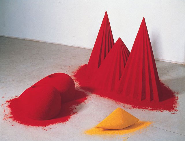
Figure 66: Anish Kapoor, As If To Celebrate I Discovered a Mountain Red Flowers (1981, Mixed media: wood, cement, polystyrene, pigment, 107 x 305 x 305 cm overall.) Collection: Tate. Image © Anish Kapoor. Image supplied by Anish Kapoor Studio. Permission to use image obtained from Anish Kapoor Studio via Lisson Gallery.
It seems to me that the use of intense colours by artists comes to illustrate their desire to look into colour, and to show that colour should not be treated as a mere rendering tool for surface, but rather as a vehicle for a spiritual essence. Kapoor (2005) explains that he sees colour not as a surface but as a form, or, as Gabo (Annely Juda Fine Art, 2003) said long before him, ‘Colour is the flesh of our visual perception of the world, not its skin’.
Likewise, I have experimented with transferring inner ideas, or moving ideas from my mind and to the audiences, and with use of intense colour in the film Unfolding Hearts (2006; ![]() ). The intensity of the images I created was achieved through inverting pictures of flowers that I had taken (fig. 67). The film deals with an artistic experience of seeing the world in brighter, vivid colours which contained a spiritual message. The script reads:
). The intensity of the images I created was achieved through inverting pictures of flowers that I had taken (fig. 67). The film deals with an artistic experience of seeing the world in brighter, vivid colours which contained a spiritual message. The script reads:
‘As I was walking [down] the street, suddenly I felt light in me and around me, as if someone pushed me from above the water from deep within…’ (minute 0.28), ‘I’ve looked around me, the sky, houses, trees, people – everything was alive, but different. All was made of sparkles of light, blinking…’ (minute 1.35).
The inversion of the images is as an attempt to invert reality, trying to bring out some qualities that are inherent within things, and which our eyes cannot see in daily life. The use of intense colours attempted to make that shift an intense one. As one feedback (![]() ) on the film noted, ‘the colours [are]… the seven magic colours in Chakras’. The seven Chakras are symbolic wheels where the spiritual and physical meet, denoted by seven intense colours, each representing a specific quality in the person (fig. 68).
) on the film noted, ‘the colours [are]… the seven magic colours in Chakras’. The seven Chakras are symbolic wheels where the spiritual and physical meet, denoted by seven intense colours, each representing a specific quality in the person (fig. 68).
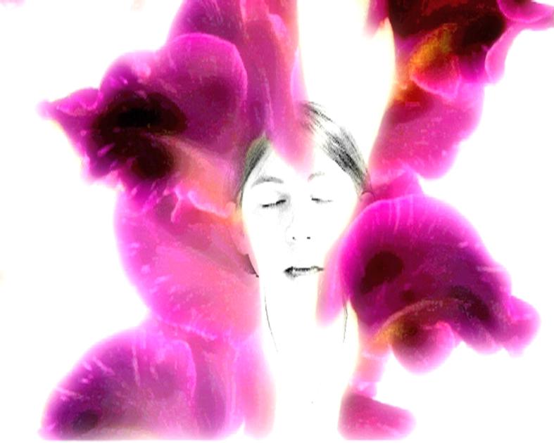
Figure 67: Still image from the film Unfolding Hearts (2006). Image © Gil Dekel.
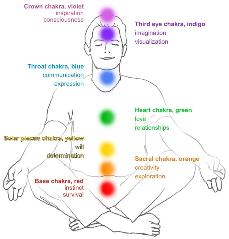
Figure 68: The seven Chakras. Image © Gil Dekel.
Gilbert & George shed new light on the way that intense colour can deliver inner ideas. They (Bickers & Wilson, 2007: 323) assert that the colours that they use originate from themselves, from their own essence, and not from the outside reality:
‘We started with ourselves, not with copying artistic trends that are seen in museums. It took us years to find red colour, whereas artists start with all colours on their palette, first thing. It took another three years to find yellow.’
I infer from this that the intense colours used in their works come from knowing themselves, not from using colours that were the ‘trend’ in the cultural scene. Vivid red, yellow and blue are the extensions of the artists themselves, and to evidence this they tend to use their own image as a signature that renders the colours in their works (fig. 69).

Figure 69: Gilbert & George, Planed (2007, electronic image). Work released to the public domain by the artists through the BBC and Guardian websites, May 2007.
The specific work of Gilbert & George chosen here (fig. 69) was released by the artists over the internet to the public domain as a free gift, just after the showing of a BBC documentary on the artists (May 2007). Doing so, Gilbert & George managed to extend the intensity of the colours in this work – beginning in themselves, moving through their cameras, computers, the BBC TV documentary, the internet – and ending in many forms on the computers of downloaders, who might continue to distribute the light by printing it.
Vivid colours are noted for their force of moving with intensity from what artists describe as spiritual realms and into the physical reality. However, the same quality of movement can be reversed by use of transparent colours. Transparent colours are noted for their translucent quality that allows one to see through the layers. Unlike intense colours that assert a definite artistic statement, the fluidity of transparent colours suggests a sense of blending of several emotional levels that artists express.
By using transparent colours artists observe the process in which things change from one thing to another, or blend one into the other. Watercolour painter Chan (![]()
![]() para. 7) explains, ‘I pay particular attention to the way in which the light falls and how this changes the colours that can be seen. The colours of flowers can be vibrant, intense or delicate’. Chan has an interest in the transition of colours and emotions, which she tries to capture through the transitory quality of watercolours (fig. 70).
para. 7) explains, ‘I pay particular attention to the way in which the light falls and how this changes the colours that can be seen. The colours of flowers can be vibrant, intense or delicate’. Chan has an interest in the transition of colours and emotions, which she tries to capture through the transitory quality of watercolours (fig. 70).
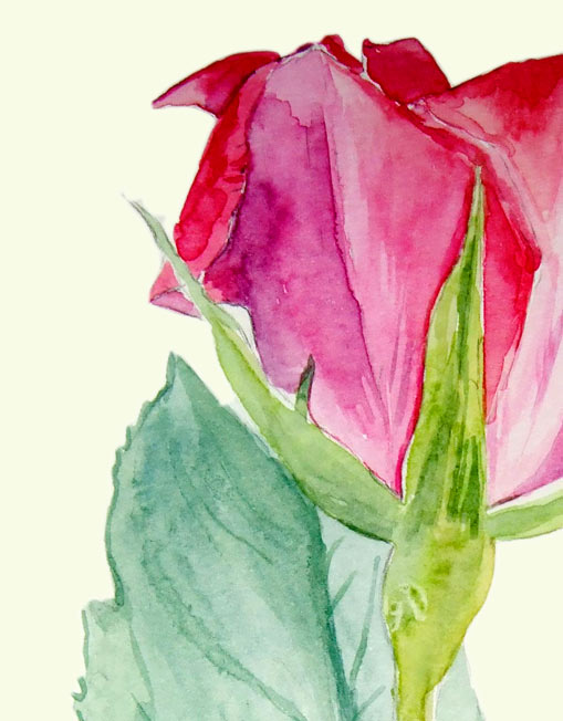
Figure 70: Melanie Chan, Rose 2 (detail) (2007, watercolours on paper, 21 x 42cm.) Image © the artist. Permission to use image obtained from the artist.
The transitory quality of colours can challenge the assumption that an image is observable through separation of its colours. According this assumption when the mind sees different colours it can compare the differences, thus seeing objects more clearly. In that view, if all colours were to blend they would then produce pure black or pure white or grey, as illustrated in fig. 71.
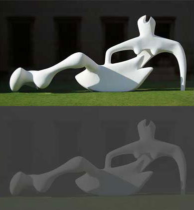
Figure 71: High contrast image (top) and low contrast (bottom) (showing Henri Moore’s Reclining Figure (1951). Photograph © Andrew Dunn. Photo released to public domain by the photographer.)
Yet, the tendency of watercolours to disperse into the paper and produce layers of colours seems to embrace different colours, not separate them. The layering of colours manages to produce a noticeable image, with the viewer’s eye piercing through layers, receiving different levels of the blending quality.